App Overview
Thanks for checking out the Decision Journal app! Let’s dig into the details about how it works.

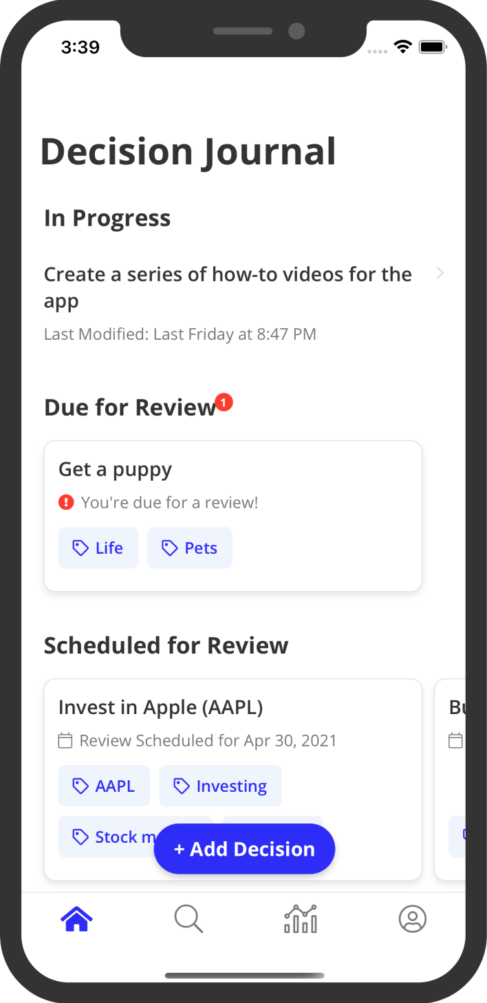
As you add decisions in the app, they will be separated into four different sections on the home screen:
- In Progress
- Due for Review
- Scheduled for Review
- Past Decisions
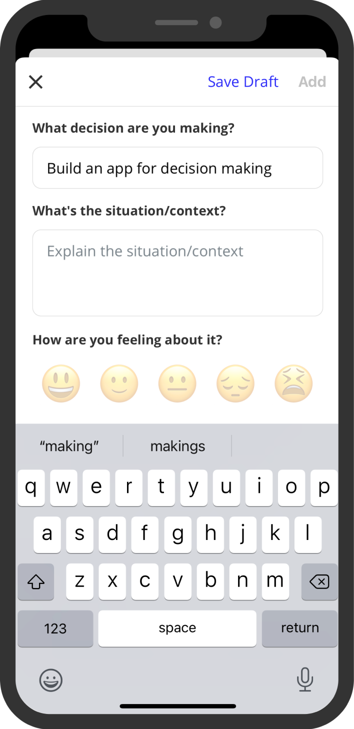
The In Progress section is for decisions that you have begun to work on but haven’t quite finished yet. You can think of the In Progress section as your decision drafts. Whenever you save a decision as a draft (see our guide on Creating Decisions here) they will show up in the In Progress section of the Home view and will always be at the top for easy access to pick up where you left off.
The Due for Review section shows up right below the In Progress section whenever you have a decision that’s due for a review. Decisions are due for a review whenever the scheduled review date is either the current date or is in the past.
The Scheduled for Review section of the Home screen is where every decision that has a review currently scheduled in the future goes. As noted above, once a decision’s review date goes from a future date to the current or past date, it gets moved into the Due for Review section.
The last section of the Home screen is where all the decisions you have already reviewed and don’t have a review scheduled go. This is where you can find any decision that you’ve reviewed in the past.
One another note on the decision sections of the Home screen is that each section only shows a limited amount of decisions under it. If there are more decisions that would fall into a particular section but not all are shown, you can tap the “See All” button next to the section’s heading to view all decisions in that category.

From the Home screen, you can also add new decisions by tapping the floating button at the bottom of the screen. This will show the Add Decision screen. For more information about creating decisions, see our guide on that here.
Tapping on any decision on the Home screen will take you to the Decision Details screen. Here’s where you can read and review previous decisions, as well as schedule or re-schedule reviews for the decision. For more information about reviewing decisions, see our guide on that here.
You can also navigate to all the other screens in the app from the home screen by using the bottom navigation bar. The magnifying glass icon will take you to the Search view. From here, you can search for any decision that you have added, including decisions that are still in progress. If you’d like to learn more about searching and tagging in the app, check out our guide on that here.
The next icon in the navigation bar is a chart icon for the Analyze view. In this view, you get an overview of all the scores from your reviews across your journal. For example, you can see your overall score, scores by tags, and scores over time. If you’d like to learn more about analyzing your decisions, check out our guide here.
The last icon in the navigation bar is a person icon. Tapping this button will show you Your Account screen. This is where you can manage your subscription (if you have one), change your notification settings, find our guides, contact our support team, and read our legal docs. You can also log out of the app from this view.
And that’s it for the app overview. If you want to go deeper on the areas of the app, check out our other guides below:
If you have any questions or feedback, feel free to reach out to us. Otherwise, enjoy the app and make better decisions!